
LO 4 • PROFESSIONAL STANDARD
Trending styles and effects
To see what has been trending or in style lately, I'll be making use of the websites Behance and Awwwards.
When searching for portfolios on both of these websites some very unique and amazing portfolios pop up. Most of these look professional and clean, this is because of their utilization of White Space. Some great examples are:
This makes the website look comfortable to look at and makes it easy on your eyes while reading or viewing their work.
And one of the most noticeable things about all of the popular and trending websites is the fact that they almost always have parallax scrolling. This makes it so that the background content (i.e. an image) is moved at a different speed than the foreground content while scrolling. Which creates an amazing experience for the viewer.
While looking at more portfolios I came across this website. They had a loading screen in the beginning that was animated which keeps the user/viewer entertained for a couple of seconds. In those seconds the site has optimized it's effects, in this case a lot of parallax scrolling and also some unique scrolling mechanic, which is very good at keeping the attention of the user/viewer.
What I have noticed as well is the use of animations. There are a lot of subtle animations which enhances the user experience. It makes the website feel more interactive. (https://cattus.dev/) (https://www.portfoliogc.fr/)
The fonts are always clean, modern and minimalistic. This makes it very easy to read and doesn't 'hurt' your eyes when reading too much. Also, the text used in the portfolios are short and powerful, not long essays, which really helps with the users attention span and the likelihood of them actually reading the text. (https://vucko.co/)
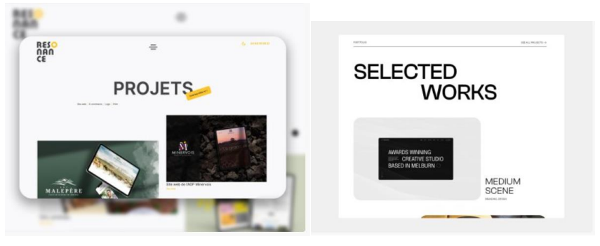
There a lot of text effects as well, like text reveals, it's like text that appears on your screen based on how far you have scrolled and it's very satisfying and also enhances the user experience. (https://resonance.bestlooker.pro/modern-multi-page.html)
Based on what I have seen so far with colours, they all use black & white as their main colours on the portfolio, and then they use a secondary colour that isn't too overpowering, and also some gradients usually black & the secondary colour.
There is a good amount of use of hover effects as well. To display or to make an element follow you. (https://vucko.co/) (https://resonance.bestlooker.pro/modernmulti-page.html)
And the most important one: (almost) Every popular and trending portfolios are an onepage website. ONLY when forwarding to projects you have to clink link that redirect you (but that's normal) but a lot of the sites are trying to fit the projects in the one-page design, maybe by extending some parts on click to showcase the project.
In summary,
If we want a trendy, popular and modern and clean website we should try to apply the things that we've learned. I will put the features in a list that I will try to apply:
- White Space
- Parallax Scrolling
- (Loading Screen to Optimize) (not necessary, but would be good)
- (Unique Scrolling Mechanic) (not necessary, but would be good)
- (Text) Animations
- A good font (Clean, Modern and Minimalistic)
- Short & Powerful Texts, and/or Visuals
- Black & White with a nice Accent Colour
- Hover Effects
- **One-Page** (most important one)
Conclusion,
I will be using this document to justify my (design) choices as it's solidly backed up by the research done.
I will also use inspiration from the websites (portfolios) that I have looked at and analysed.
Context
In our first sprint the topic was "branding", our client was the Soundlab at Fontys R10. And our target group would be everyone in semester 2/3, so I interviewed two students to gather information on what style and theme they prefer.
I used a questionnaire as help to get a more accurate result. I asked my UX teacher to check if the questionnaire had good questions and if there were some specific things that I could add to make it easier for the interviewees.
The teacher was quite satisfied with how it looked, however they warned me about the risk of getting a biased opinion on some of the keywords, such as "minimalistic", so they advised to use images to showcase exactly what you mean, this way you get a lot more accurate results. They also warned about the possibility that two sexes could have different opinions on what they want to see, but this was already taken in account for, so the questionnaire didn't have themes or styles that would only attract one of the sexes.
After this feedback I gathered, the questionnaire was improved by adding more accurate images next to keywords and rephrasing some of the questions to get a clear answer instead of "yes" or "no".
Link to the questionnaire used: questionnaire (google forms)
The results of the interview:
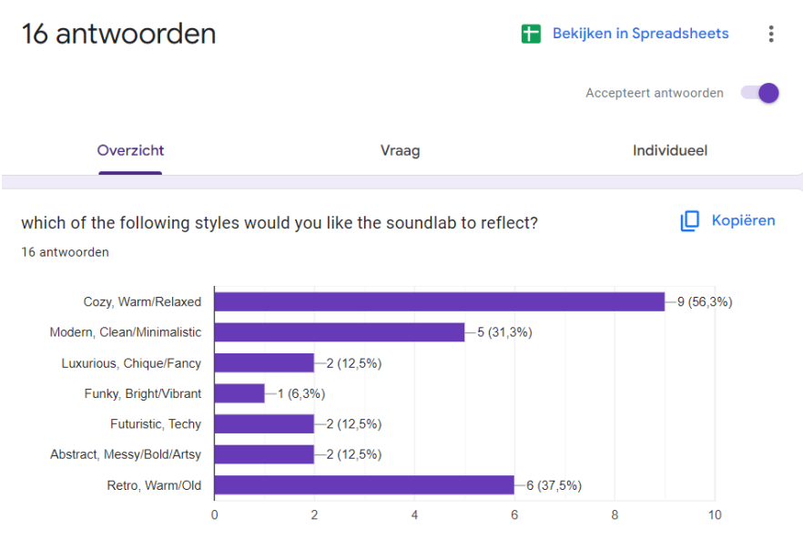
(When I was asking this question the images were present.)
Person 1 chose: Modern, Clean/Minimalistic.
Person 2 chose: Cozy, Warm/Relaxed.
"If you think of the style you've just chosen, which feelings come to mind?"
Person 1 said: calm, high quality.
Person 2 said: Bij luxurious: voel ik meer een podcast achtig iets, ook voel ik hierbij dat het vooral bestemd is voor premium content creation. Bij cozy: Dit is de meest toeganklijke design. Hier kun je oud muziek opnemen, en ook nieuw muziek. Ook is dit design gedschikt voor verschillende genre podcasts.
"If you think of the style you've just chosen, what colours come to mind?"
Person 1: black, gray, white, darker hue.
Person 2: bruin (hout), warme temperatuur lichten, donkere kleuren.
"Which name do you like the most?"
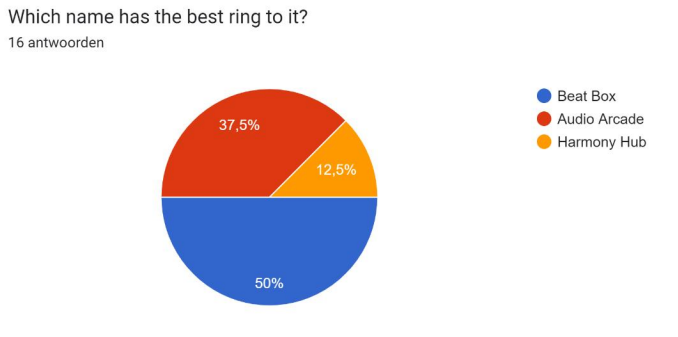
Both chose for "Harmony Hub"
"Which logo do you find the most fitting?"
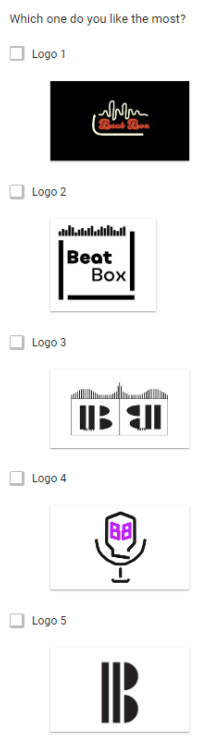
Person 1 picked: Logo 2
Person 2 picked: Logo 1
"What keywords come to mind looking at your chosen logo?"
Person 1: (Modern), Bold.
Person 2: Welcoming, Creatief.
Conclusion and reflection
After this interview with the help of a questionnaire I got a better insight of what was generally preferred as the style and theme, as my peers had also conducted interviews. After comparing the answers with eachother it was decided to go with a retro, cozy style based on everyone's results. Now we had a clear style and theme to work on and a solid reasoning as to why we chose it, to then present it to the client.
I really liked the questionnaire as a helping tool as it made it way easier to note the answers. It also made it easier for the interviewees to answer because they saw visuals with the questions which made it less biased and also less thinking for them.
Context
We got a new project after finishing the first one:
Our target audience are people who want to to do a part-time study (deeltijd studie) at fontys ICT. Our main goal is to get more people to go to Fontys instead of other schools or to introduce them to it. To do this project as good as possible we, as a group, immediately asked our client when we could visit Fontys TQ to conudct interviews, as the client had connections there. TQ is the building where people are that already do 'deeltijd'.
Turns out they're only there on Mondays and Tuesdays after-noons. So to not waste our time we took all of that time before we visited to formulate efficient questions and made an enquete to also send it to the people that already do 'deeltijd'. Everyone thought about some questions and put them in a document. Mine were:
- "Hoe heb je de opleiding Fontys deeltijdopleiding gevonden?"
- "Welk social media maak jij het meest gebruik van?"
- "Waarom heb je deeltijd gekozen over voltijd?"
- "Hoe kwam je achter de deeltijd Fontys ICT opleiding?"
- "Wat heeft jou overgehaald om de deeltijd Fontys ICT opleiding te volgen?"
- "Was er iets opmerkelijk over de website van de deeltijd Fontys ICT opleiding? (Makkelijk of moeilijk om informatie te vinden)"
There were a lot of reocurring questions between our group, so we used the most frequent ones in our questionnaire.
The main questions:
- Hoe oud ben je?
- Waarom heb je deeltijd gekozen?
- Wat is de belangrijkste informatie om te hebben over deeltijd?
- Wanneer ben je gaan zoeken voor een studie?
- Wat vind je van ICT-deeltijd tot nu toe?
Interview day
We went to interview the students there with 4 people, however ofcourse we didn't interview one person with 4, but we interviewed one person with 2. Before we started we always asked if we could voice-record the interview with their permission. While interviewing there was a lot of “free-styling” as well, basically asking further on some answers.
We interviewed 2 students, one lasted about 10 minutes and the other 20 minutes.
I mainly asked "further" questions on some main topics like when they started, why they started or how they started. I also asked a lot about their jobs and how it correlates with the study 'deeltijd'.
Voice recordings
Here are the links to the interview voice recordings:
Second interview part 1 and part 2.
Summary of the information gained:
- A lot of diversity between students
- Almost all students are professionals
- Very big range: people that can't pay their rent so they have to work alongside their study, people who do this for their job, or people who just do it for the fun of it.
- The majority of people want to broaden their knowledge about IT
- Prices vary greatly depending on if you already have a diploma, some people get it funded through their jobs (for example for promotions).
- 20 hours instead of the 40 hours normal full-time study
Conclusion & reflection
After the interviews we acquired a LOT of information about the current situation. We had also interviewed a teacher there to get a view on the study from a general perspective. And this also gave us a lot of information. With this information we could identify the problems about the current situation, and we could also identify the touchpoints in the process of applying and studying at Fontys.
I also asked the teacher more about the students background to understand more of the various different 'cultures' present there. I asked this because it could aid the process of attracting other students by making them feel more welcome & accepted.
However, next time I would prefer a one-on-one interview with the people. As I did notice they sometimes didn't know who to talk to as we were both asking questions (not at the same time of course). It would also make them open up a bit more because I did sense that they were a little tense in the beginning. Nevertheless, the results were still great and we gained valuable information that was going to get used for the purpose of identifying problems and improving the overall situation.
Context
I have also created a persona together with a peer. This is to show the client a "typical customer" that they can expect to apply at Fontys deeltijd. This also helps us to keep a good overview on our target audience.
The persona
I wrote the:
- "Doelen en uitkomsten"
- "Hobbies"
- "Vaardigheden"
- "Situatie"
- "Social media"
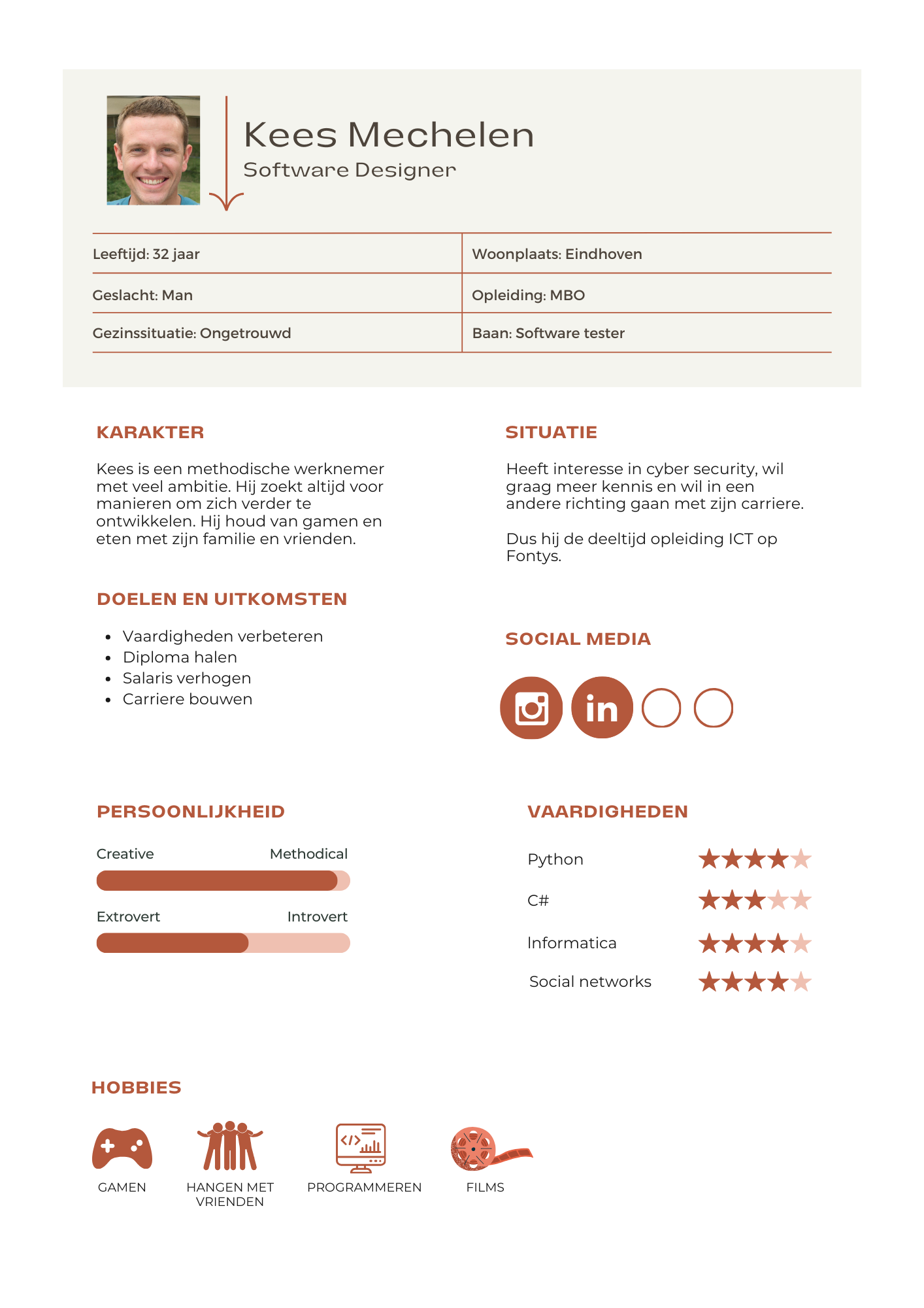
Reflection
Making the persona went smoothly and helped to pinpoint the main characteristics in our targer audience. I also learned that even though a persona isn't exactly necessary, it greatly helps you to understand your target audience better which eventually will speeden up your process and also make your overall project or product more to the liking of your target audience.
Context
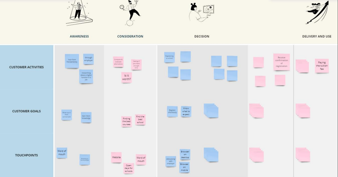
I have also made a customer journey, I know what it is because I have worked with a customer journey before and it is actually very easy to do but even though it is so easy, it is incredibally helpful to help you realise the weak points and strong points of a product or situation.
This also helps with seeing different approaches to problems instead of only a couple:
1. Wat?
We willen advertenties plaatsen op social media zodat er meer mensen worden bereikt voor de deeltijdopleiding ICT Fontys. We zijn hierop gekomen na een grondig onderzoek op onze doelgroep. We hebben interviews uitgevoerd en ook een (online) enquête uitgedeeld bij de afdeling ICT bij Fontys TQ, aangezien daar mensen zitten die ervoor hadden gekozen dus konden we vragen waarom of hoe zij erop waren gekomen.
2. Waarom?
Tijdens het onderzoek op ons doelgroep bleek dat de meeste mensen gebruik maakte van Instagram en LinkedIn kwa social media. En met het gebruik van social media kunnen we ook een grotere schaal bereiken dan als we bijvoorbeeld flyers of posters zouden ophangen. Dit zou technisch meer efficient zijn en dus zou ook meer mensen kunnen aantrekken.
Gelukkig heeft Fontys al een mooie reputatie, wat ook gelijk de grootste reden was waarom mensen voor Fontys hadden gekozen (uit de enquête), hierdoor hoeven we niet perse extreme campagnes uit te voeren. Maar meer het “verspreiden” dat de optie deeltijd ICT ook bij Fontys bestaat.
Wel zou een nadeel kunnen zijn dat het niet heel 'persoonlijk' kan overkomen, hiermee bedoelen we, stel je ziet een poster in je ICT-afdeling bij je bedrijf, dat zou je meer aanspreken dan een online ad.
3. Hoe?
De advertenties zullen geplaatst worden op Instagram of LinkedIn, maar het zal niet “altijd” geplaatst worden. Het zou namelijk heel duur zijn om de advertenties te runnen voor een hele lange tijd en dus zou het ook niet heel efficiënt zijn kwa budget. Maar gelukkig hadden we ook de vraag van “wanneer ben je begonnen met het zoeken voor je studie?”.
Dit kan ons heel erg helpen met het pushen van de advertenties op de juiste momenten. De meerderheid was begonnen met het zoeken in September (25,8%), maar ook een grote deel in Maart (16,1%), Januari (12,9%) en Mei (12,9%).
Nu dat we weten wanneer de meerderheid begint te zoeken, kunnen we ze beter 'targetten' met de advertenties en ook gelijk de kosten verminderen omdat het niet 24/7 online is door het jaar heen.
4. Evaluatie
Natuurlijk willen we dan ook weten of het allemaal wel heeft gewerkt. Daarom is een voorstel om te meten hoeveel mensen er eerst aanmelden zonder dat dit allemaal is geïmplementeerd (liever al dat het bekend is met eerdere data zodat je zo min mogelijk potentiële studenten misloopt) en het weer opnieuw gaat meten wanneer dit plan in effect is.
Stel het blijkt dat er positieve verandering is gekomen en hierdoor een stukje meer mensen zijn komen aanmelden, is het wel belangrijk om het niet steeds hetzelfde te houden bij de advertenties. Bijvoorbeeld, verander het een klein beetje elk jaar tijdens de drukke maanden.
Stel het blijkt dat er geen verandering is gekomen, dan is het een optie om te gaan kijken naar wat meer 'persoonlijke' advertenties. Dit kan bijvoorbeeld zijn dat er meer “word of mouth” wordt gebruikt door middel van werkgevers. Of posters ophangen bij ICT-bedrijven. Dit kan ons doelgroep dan wat meer 'persoonlijk' aanspreken.
5. Conclusie
Kortom, we verwachten dat de nummers van de aantal aanmeldingen voor de deeltijd ICT-opleiding op Fontys zal stijgen door middel van advertenties op social media te plaatsen op juiste “drukke” momenten/maanden waardoor we de meeste van ons doelgroep kunnen bereiken op een grote schaal zonder dat het absurd duur wordt.
Context
I have also created a persona together with a peer. This is to show the client a "typical customer" that they can expect to apply at Fontys deeltijd. This also helps us to keep a good overview on our target audience.
The persona
I wrote the:
- "Doelen en uitkomsten"
- "Hobbies"
- "Vaardigheden"
- "Situatie"
- "Social media"
Reflection
Making the persona went smoothly and helped to pinpoint the main characteristics in our targer audience. I also learned that even though a persona isn't exactly necessary, it greatly helps you to understand your target audience better which eventually will speeden up your process and also make your overall project or product more to the liking of your target audience.
Context
I have also made a customer journey, I know what it is because I have worked with a customer journey before and it is actually very easy to do but even though it is so easy, it is incredibally helpful to help you realise the weak points and strong points of a product or situation.
This also helps with seeing different approaches to problems instead of only a couple:
Context
To get a good overview of projects and your group you need a good way to keep up and manage it. So we used some ways to do this.
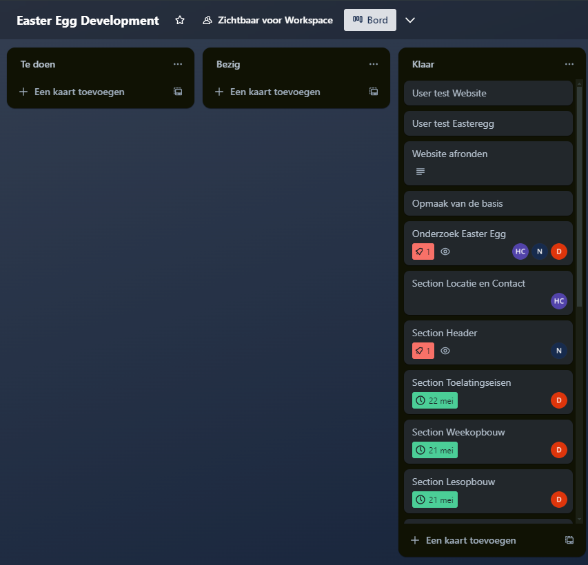
Trello
We used trello for the development sprint:
Team charter
The first group I was in, I told them how important a team charter is as some of them were thinking of it lightly, this was our charter: PDF I wrote the "Team Rules" part, mainly my propositions but ofcourse we all decided on it collectively.
We used whatsapp to communicate private matters, like coming later, saying ur ill, etc.
Teams
We used teams as a way to send files and share our documents with eachother, as a Teams group makes it easy to navigate through it.

Reflection
I liked the way the communication went, it went very smoothly and we rarely had any problems.